The purpose of your site is to reach as many people as possible, on as many devices as possible. The problem with some sites is they only fit one screen size, and that option is your desktop or laptop. Yet, in 2013, tablet shipments have outpaced laptops, and that trend continues to move forward. Tablet sales are expected to exceed $100 million before 2014. And, mobile device usage is soaring, with the majority of U.S. subscribers owning smart phones. This means, you want a site that can work on and fit any device.
In December of 2012, Mashable Magazine declared 2013 to be the year of responsive Web design. The world is currently in the post-PC era. By 2014, over 50 percent of site traffic is expected to originate from mobile devices.
What is responsive Web design? These are sites that are built on a fluid grid. They use media queries, which match the page to the media type of the device, as well as efficient CSS (cascading style sheets). This gives the site the ability to scale up or down, depending on the device’s screen size.
A website grid with pixels
So, instead of creating a website and a mobile site, you can use responsive web design as a one-size-fits-all solution. Fixed sites, which are structured around PC’s, are rapidly becoming a thing of the past. For example, when creating a website grid, you would use pixels to set the size. With responsive web design, you would use percentages in order to make the site more malleable.

A website grid with percentages
Ethan Marcotte, a pioneer in this field, wrote the book, “Fundamentals of Responsive Web Design,” which discusses, in detail, media queries and responsive architecture. And, it makes use of HTML 5.
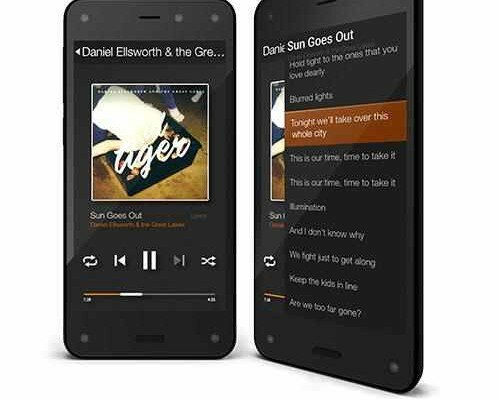
Here are some sites that make stunning use of responsive web design:

Image via
An Event Apart is a company that sponsors web design conferences around the U.S. Their site evokes very clean lines with eye-popping colors. Not to mention, it works well on your PC or your mobile device. An added bonus is the lazy-loaded images. Pictures only start to appear as you scroll down.

Image via
BBC News was declared the best mobile responsive site of 2012. It utilizes both progressive enhancement and flexible images. And, its pages load faster than expected for mobile sites. Any device can access the BBC site.
For cost efficiency and utility, responsive web design is the future, and it should be given serious consideration.
By


Carin Thumm
Loving this information! Having a website that works on any device is a must these days.
Katrina
Hi Carin,
I’m glad you liked the article!
James B.
This article is spot on. The best thing about HTML 5 is the design savings.
Katrina
Thanks James!
Garland
If your site isn’t responsive, people will quit you.
Katrina
Garland,
That seems to be happening more these days!
James W.
I’m trying to spread the word about responsive Web design. This is a good article.
Katrina
James,
Thanks!